Blackletter, Varsity and Script: How Three Sister Stores Use Lettering

Before anyone takes in the picture on a shirt, they read the letters. The shape of those letters sets the mood of the whole design: sharp and gothic, loose and hand-written, or stacked like a college sweatshirt. Here we look at three sister stores that lean on lettering in very different ways, Alix Earle, Saltburn and Lionheart, and at what each style does on a garment. If you like the type on our own designs, from the red italic Red Light lettering to the blue graffiti letters on Aim Nothyng, this is a good way to see how far one idea can stretch.
Why does lettering matter so much on merch?
A design on a tee is read from a few metres away, often in passing. Lettering is the fastest way to say what a piece is about. A few things decide how it lands:
- The letterform itself. Blackletter reads old, heavy and serious. Varsity letters read sporty and young. A hand-written script reads personal and relaxed.
- Colour. One deep colour feels calm; every letter in its own colour feels playful.
- Layout. An arch over a picture frames it like a badge. A tall stack of capitals turns words into a block you can see across a room.
- What sits next to it. The same blackletter looks very different beside a snake, a halo of rays or a bunch of roses.
Keep those four in mind and the three stores below start to make sense side by side.
Alix Earle: serif, script and varsity in one collection
Alix Earle is an American social media personality from New Jersey who studied marketing at the University of Miami and started posting on TikTok in 2020. Her podcast, Hot Mess with Alix Earle, was announced in 2023, and that name runs through most of the designs on her store. What makes the collection interesting from a lettering point of view is how many ways it sets the same two words.
There is a tall bold serif, HOT MESS, IT'S A LIFESTYLE, sitting over a disco-ball heart, in a red version and a pink one. There is a flowing hand-written hot mess. over a neat With Alix Earle line, all in a deep wine colour, which is the quietest piece in the store. HOT MESS EXPRESS goes the other way: three lines of towering black capitals with a small tan heart. And WWAD? is scribbled in pink over a strip of photo-booth frames, so the lettering looks like it was added by hand afterwards.
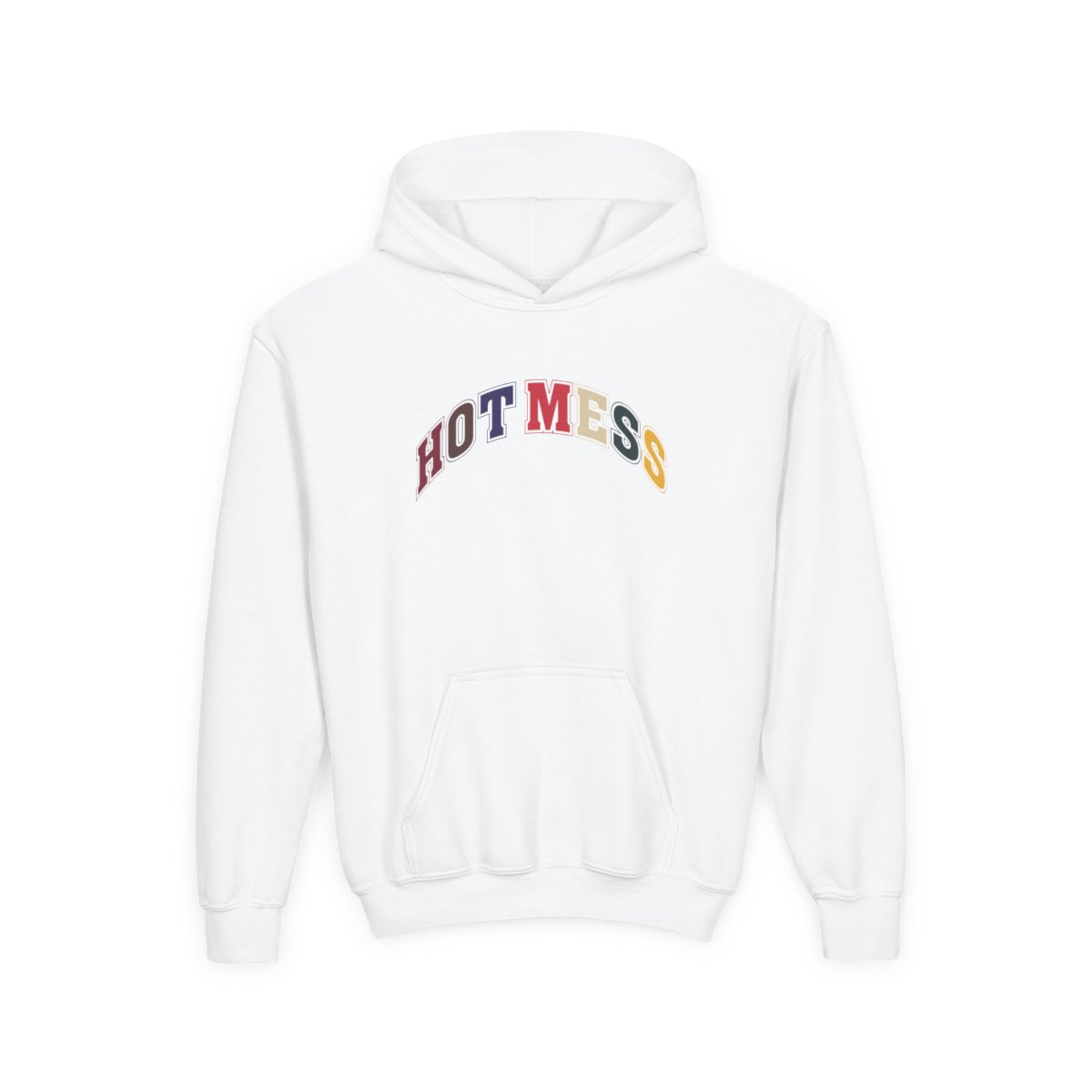
The one that shows the varsity idea best is the Hot Mess Varsity youth crewneck: HOT MESS in a college-style arch, each letter its own colour from wine to gold. It is a campus look built from nothing but type, and it shows how much a colour change per letter adds without any picture at all.
Saltburn: blackletter with a coastal, gothic edge
Saltburn takes its name from Saltburn-by-the-Sea, a seaside town in North Yorkshire that the Victorian entrepreneur Henry Pease developed as a resort. The town still has its pier, which opened in 1869 and is the last one left in Yorkshire, and a cliff lift from 1884 that is the oldest working water-balance cliff railway in the UK. The store's own look is black, white and blackletter: a heavy gothic wordmark that sets the tone for everything else.
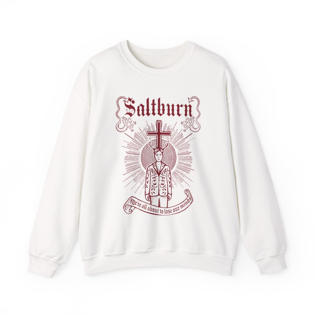
The lettering here works with old-looking illustration rather than against it. The Antler Halo crewneck is the clearest example: a woodcut-style design with the blackletter name, two dragons and an antlered figure in a halo of rays. The heavy gothic letters and the carved-looking lines share the same weight, so the whole design reads like a page from an old book.
The other Saltburn designs use the same name more quietly. Blue Silhouette puts a small blackletter saltburn under a white antlered figure cut out of a blue-lit frame. Ouroboros Live Fast wraps a forest-green snake around a grainy portrait, with an arched slogan above and the gothic name below. Three Hearts drops the type altogether for three hand-drawn red hearts, a useful reminder that a collection with strong lettering also needs a plain piece.
Lionheart: hardcore blackletter, arches and badges
Lionheart is a beatdown hardcore band from Oakland, California, fronted by Rob Watson, with records that run from the This Means War EP in 2006 through Love Don't Live Here in 2016, Valley of Death in 2019 and Welcome to the West Coast III in 2022. Their designs use blackletter too, but the mood is completely different from Saltburn's: heavier, louder and closer to tattoo art.
Look at how many ways the band name gets set:
- Red Blackletter: Lionheart in sharp gothic letters traced in a single deep red outline, with red fragments on the back.
- Judgment Doesn't Sleep: chrome blackletter over a skeleton hand and orange roses.
- LHHC Crosshair: LHHC in blackletter inside a thin crosshair circle, above the word HARDCORE.
- Pitbull Mentality: camo arch letters spelling LHHC, a hardcore take on the same college arch the Alix Earle varsity piece uses.
- Trial By Fire: thick distressed red capitals with grit between them, the plainest and most direct of the set.
Several designs also nod to the records by name, such as Love Don't Live Here with its hooded skull figure and the Valley of Death panther wrapped by a teal snake. The band's own rundown of their records from 2014 to 2022 is the best place to see where those titles come from.
What do the three styles have in common?
Put the three stores next to each other and a few patterns repeat:
- The arch travels. Alix Earle uses it for a varsity look, Saltburn for a slogan over a snake, Lionheart for camo letters. Same layout, three moods.
- Blackletter is not one thing. On Saltburn it pairs with woodcut dragons and rays; on Lionheart it turns chrome, red or crosshaired. The letters stay, the company they keep changes them.
- One colour or many. The wine script and the single red outline are calm; the multi-coloured varsity letters are loud. Both work, for different days.
- Plain pieces matter. Three Hearts and Trial By Fire show that a collection reads better when not every design shouts.
On our side, the Gothic Cross Collage design stacks anchors, crescents and crosses under two mirrored B letters, so it sits closest to the blackletter end of this spectrum, while the Christmas sweater design with its red BLADEE lettering between green pixel trees is pure pattern play. If one of these three styles catches your eye, our shop has the designs to wear beside it.